Description :
A complete visual identity system — one silhouette carrying three readings: leaf, feather, and turning page.
Live. Learn. Belong.
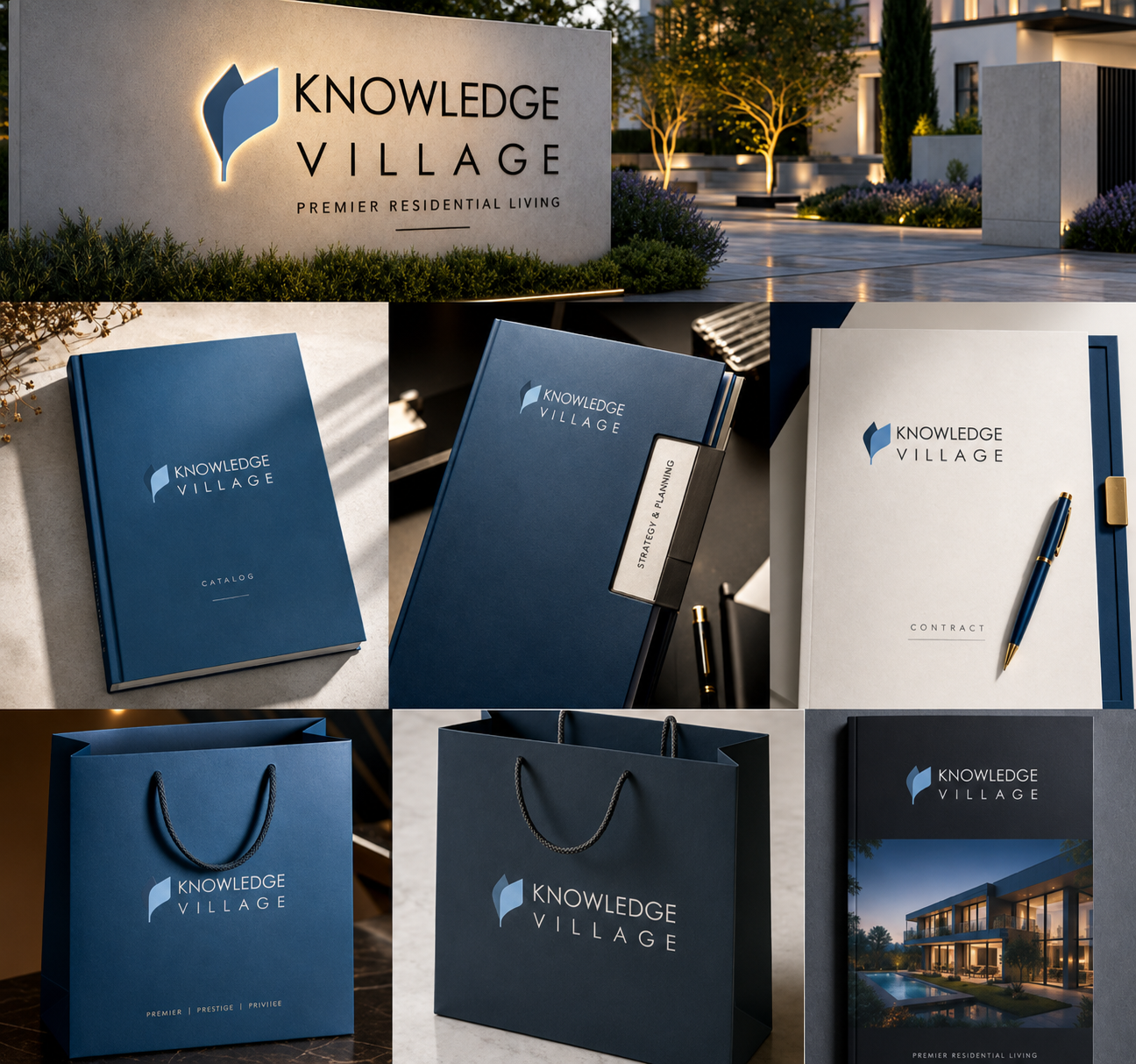
As a leaf it means life — growth from a single root. As a feather it means knowledge — the original instrument of writing. As a turning page it means learning in motion, never learning stored. Drawn twice: a darker form that holds and a lighter form that rises. That second shape is the village.

The mark is flat, solid colour — no gradient, no transparency, no shadow. Correspondence is the most reproduced surface a brand has, and Knowledge Village is drawn to survive print, copy, scan and reprint unchanged.
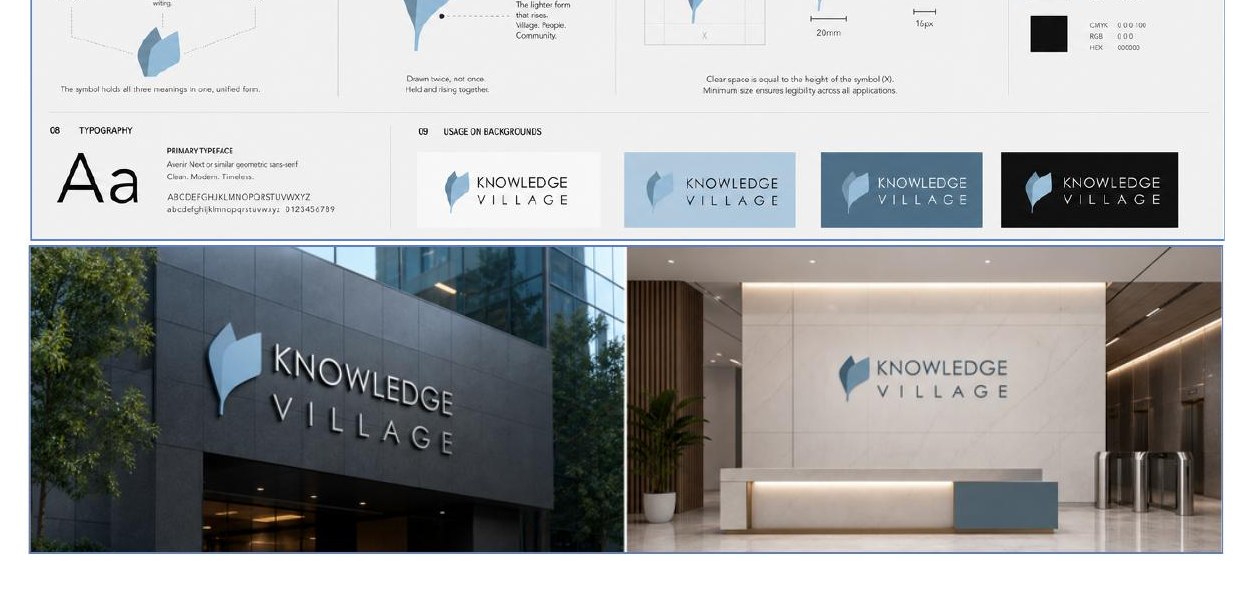
Light, mid, dark and black grounds keep the mark readable from letterhead to monument sign. The wordmark stays geometric, with open tracking on VILLAGE for balance beside the twin-leaf symbol.


Letterheads, envelopes, contracts and kits — flat colour that survives years of reproduction.

Hoardings, monument signs and building crowns — drawn for metres, not centimetres.

Pure vector geometry — two closed paths, two fills — sharp on every screen density.
Full service information connected to this work — same detail you see on the Services pages.

 Yaqoub Holding
 Manhattan Towers