Description :
A high-contrast serif lockup and geometric emblem balancing architectural permanence with organic olive green luxury.
Structural permanence. Biophilic design.

The identity sits at the intersection of structural permanence and biophilic design — an elegant serif lockup balanced by a geometric emblem that anchors the brand system. Created with precision. Inspired by nature.

Angles and mathematical modules (X) keep every curve structurally stable — modern architecture fused with organic balance so the mark holds on lobby walls and high-rise façades alike.
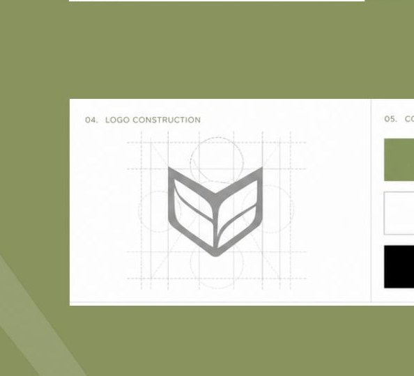
Organic olive with commanding black balances sustainable luxury and corporate sophistication. White with olive strips clutter away — light, space and environmental connectivity for premium residential comfort.


Serif wordmark and geometric emblem for strength, elegance and growth.

Print, digital and tactile surfaces — cloth, hard materials and marketing layouts.

Campaign and environmental systems ready for sales centres and digital.
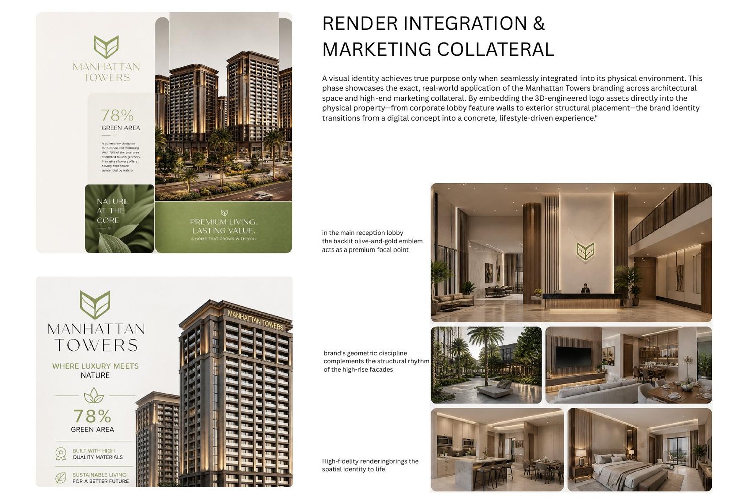
Lobby feature walls, façade rhythm and high-fidelity spatial identity.
Full service information connected to this work — same detail you see on the Services pages.

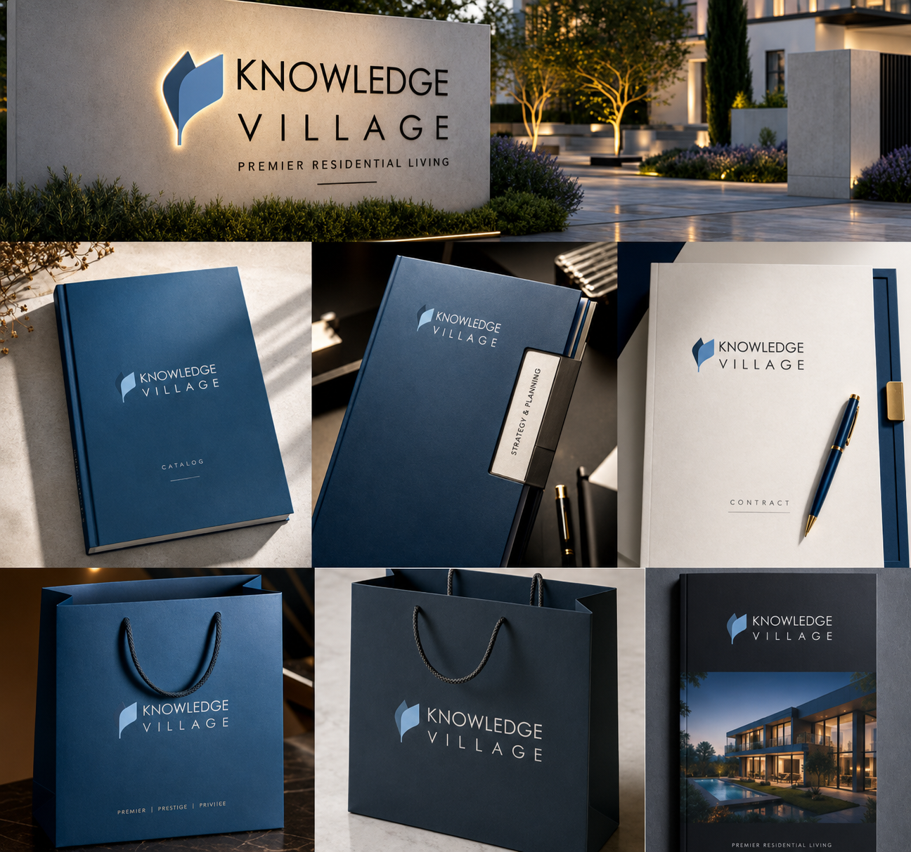 Knowledge Village
 Yaqoub Holding